
App & Responsive Website
Project Duration: 8 hours
My Role: Lead UX Designer, Graphic Designer, Branding
Project Goal.
Design an app that allows users to access & manage all tasks related to content creation projects, meetings, networking, and more.
BACKGROUND
Content Creators are all around us, some really experienced, and some are just starting off. Being a content creator is a lot of work, so I designed an app to serve as a content creator’s mobile manager. Another main goal was to increase individual creator efficiency, make creating easier, and make it cheaper for users to pursue content creation as a career path.
Understanding
the user.
Designing a user interface (UI) for an app that facilitates access and management of talks related to content creation requires careful consideration of user needs, intuitive navigation, and clear presentation of information.


Key Challenges
Balancing Functionality with Simplicity: There was a temptation to include numerous features and options to cater to various user needs. However, overcrowding the UI with too many elements can overwhelm users and make the app difficult to navigate. Finding the right balance between functionality and simplicity was crucial.
Ensuring Accessibility: Content creation projects should be accessible to users with disabilities, including those with visual or motor impairments. Designing a UI that complies with accessibility standards and provides alternative means of interaction, such as keyboard navigation and screen readers, was challenging but is essential for inclusivity.
Feedback and Iteration: Gathering feedback from users and iterating on the UI design based on their needs and preferences was an ongoing process. I faced challenges in interpreting user feedback, prioritizing design changes, and implementing updates effectively to enhance the UI over time.
User Research: Pain Points
-

Complex Navigation
Users struggled to find the information they needed due to complex navigation structures or unclear labeling of menu items and buttons. This lead to frustration and inefficiency in accessing talks, project details, or relevant discussions.
-

Information Overload
Content creation projects often involve a large amount of information, including project timelines, tasks, discussions, and files. Users felt overwhelmed by the sheer volume of information presented in the UI, making it difficult to focus on what's important.
-

Accessibility Barriers
Users with disabilities encountered accessibility barriers when navigating the UI, such as insufficient contrast, lack of keyboard navigation options, or inaccessible interactive elements. This prevented them from fully engaging with the app and accessing its features.
-

Inefficient Search Functionality
The app lacked robust search functionality or filters, users struggled to quickly locate specific talks, discussions, or project-related content. This resulted in wasted time and frustration as users manually sifted through irrelevant information.
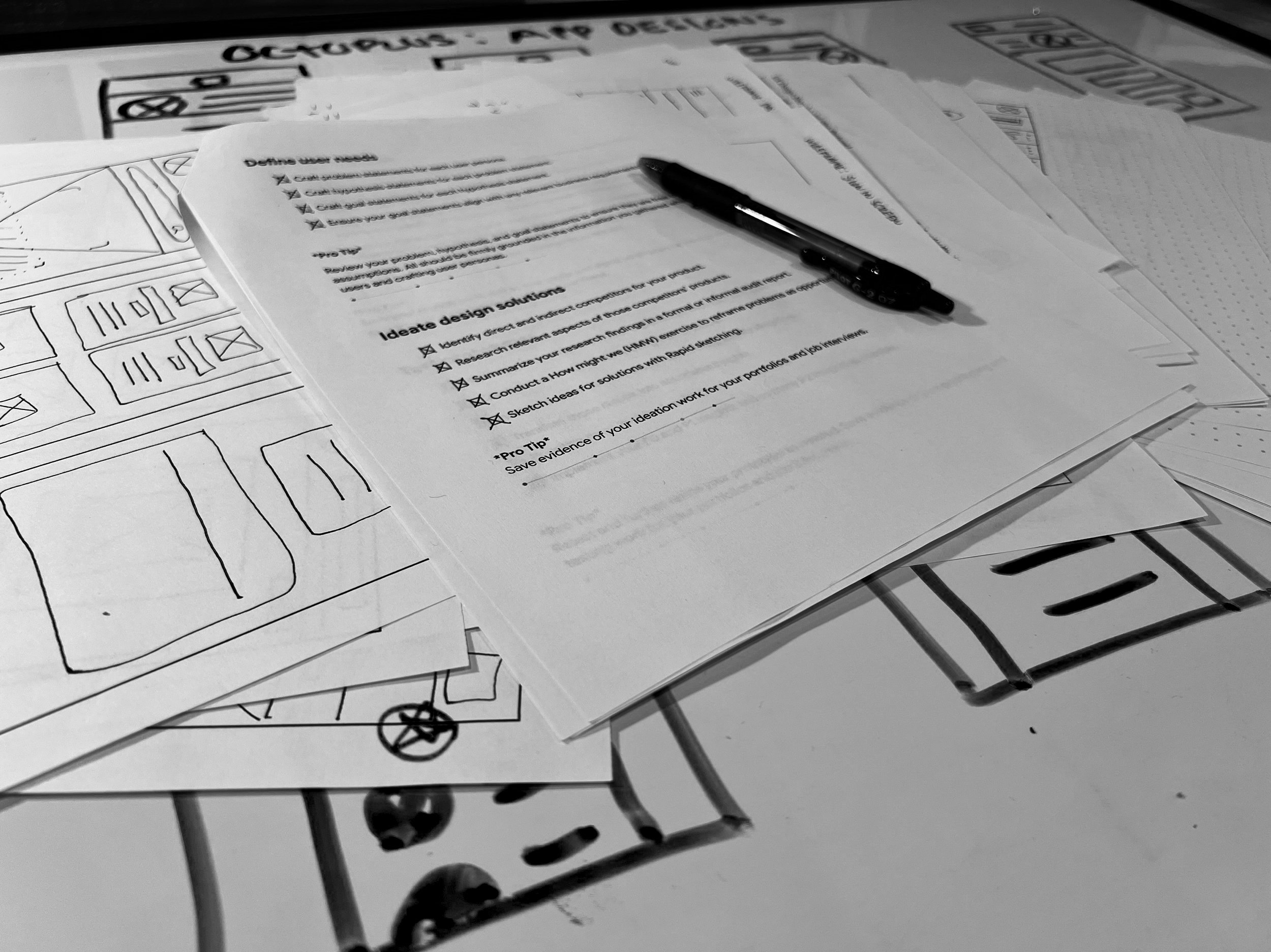
Sketches
& Wireframes
Before I started sketching, I had a general concept in mind that was focused on a minimalistic centered UI. I used this concept to quickly draft some paper wireframes, all of them were centered layouts with minor changes here and there to produce a diverse set of options. From there I imported photos of the paper wireframes into Figma to create the digital wireframes.
User Testing Results
-
Round 1A
User testing revealed how successful participants are in completing common tasks within the app, such as scheduling a meeting, accessing project-related talks, or joining a discussion.
-
Round 1B
Observing the time it took for users to complete tasks provided insights into the efficiency of the UI design.
-
Round 1C
User testing uncovered instances where participants encountered errors or made mistakes while navigating the UI.
-
Round 2A
Collecting feedback from participants about their overall satisfaction with the UI design provided qualitative insights into the user experience.
-
Round 2B
Observing how users navigated between different sections of the app, accessed project-related talks, and moved through the UI revealed the effectiveness of the navigation design.
-
Round 2C
Testing with participants who have diverse abilities uncovered accessibility barriers within the UI, such as insufficient contrast, inaccessible interactive elements, or challenges with keyboard navigation.
Hi-fidelity prototype


Conclusion
By addressing major pain points through thoughtful UI design, usability testing, and ongoing iteration based on user feedback, I was able to create a more user-friendly and efficient app for managing talks related to content creation projects.